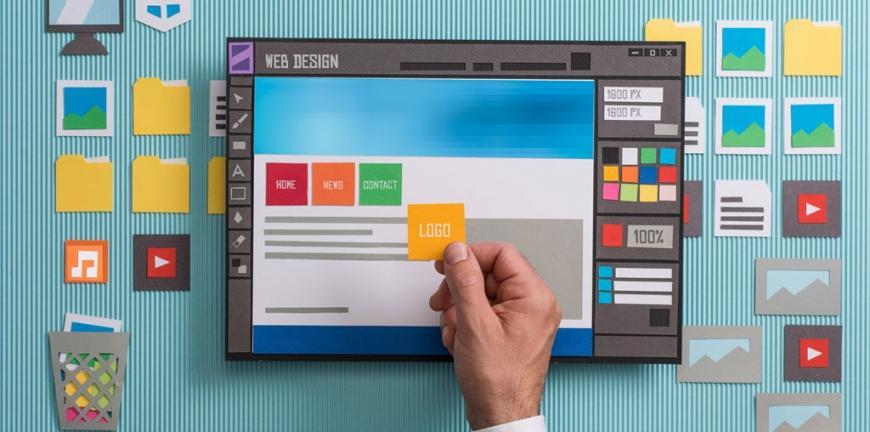
In today’s age of the Internet, creating a functional website has become easier than ever. There are all kinds of content management systems like WordPress and Shopify that any average user can use to create a website for personal or business purposes. However, just creating a decent-looking website isn’t enough if you want it to be loved by the masses. A functional website should also be visually appealing and have a unique style.

The following are 5 design tips that you can follow to create a professional website:
1. Have a Minimalistic Approach for the Homepage
Technology has had a huge impact on our general behavior. For instance, we now have a shorter attention span than a goldfish which has a lot to do with how we consume media online and are constantly interrupted by notifications and messages on your smartphones. In the context of website design, what it means is that you should try to follow minimalism whenever possible. For instance, rather than filling the home page with tons of content, you can use shorter sentences and paragraphs and fill the blank space with interesting visuals instead. Sure, you can’t expect to finalize the page with calls to action and key details that explain your business, but the way you present all this information can always be condensed and filtered.
2. Use a Unique Logo
Because there’s so much competition on the web, it’s really important to differentiate yourself from others in your niche if you want your business to get noticed. Luckily, there’s a simple solution – branding your website with a logo and brand identity.
One of the first things that users will look for when they come to your site is your logo, because they see it as a sign that you’re a company they can trust. And, you’ll want to have a logo that’s unique, so that your audience remembers you after they leave your site.
It’s easy to create a logo, and you don’t even have to start from scratch; you can try a logo maker that simplifies the process to create gorgeous designs in a matter of minutes. Just make sure that the logo you create matches your niche and is relevant to your target audience. A children’s party planner, for example, would want to use bright colors and an informal font, while an accounting firm would do better with muted tones and a traditional typeface.
3. Improve Readability
Readability refers to how easily someone is able to recognize words and sentences on your website. If your website has a high readability, then the users can take in a great deal of information with ease, and vice versa. To improve the readability factor, you can follow these techniques:
- Pick a font that’s comfortable to the eyes. It should make the text pop and make the words easier to read. You should also pick an appropriate size and try to keep it as high as possible (go for at least 16pt).
- Ensure that there is enough contract between the text and the background.
- Don’t use different kinds of fonts on the same page. 2-3 variations are generally enough. If you really have to use a larger number of fonts, then at least ensure that they work well together. It won’t harm to learn the web typography rules too.
4. Keep Mobile in Mind
When you are designing a website, then you always need to remember that a greater number of people will visit it from their smartphones than big screen devices like laptops and desktops. So, the website must be mobile-friendly and adapt according to different screen sizes. Besides, having a non-mobile-friendly website also has a huge impact on Google’s SERPs which affects its online visibility.
5. Make it User-Friendly
There are various ways to launch a website successfully, but the true success of a site is defined by how easy it is for a user to navigate it and find what they need. There are some fundamentals to it that you need to know for that. For instance, you should create a simple and easily locatable menu, add a link to the homepage to your logo, include all the important links in the footer, and highlight the important content on the pages.
Bottom Line
Designing the perfect professional website takes time and effort. However, you can save both by doing your homework and proceeding with a plan. The information above can certainly be of huge help and nudge you in the right direction at the very least. Good luck!
